Why This Project, Why Now
The Beauty Chef has long been a brand I’ve looked to for innovation, creativity, and leadership within the wellness space, and one that aligns naturally with my goal to create more work in luxury wellness product photography. Beyond the visual identity, it’s a brand I genuinely connect with through its products – particularly with how they make me feel, the ingredients they prioritise and the rituals they encourage.
This personal project came from a desire to translate that feeling visually. At this stage in my career, it felt important to slow down, experiment and create without constraint – to use photography as a tool for refinement rather than output. This project became a way to explore my evolving style and reconnect with the kind of work I want to be creating more of.
The Intention Behind This Luxury Wellness Product Photography Project
This shoot was never about experimentation for the sake of it. It was intentional from the outset. I wanted to refine my approach to lighting, styling and composition reflecting that seen in the luxury wellness product photography space. Particularly working with diffusion paper and soft boxes to create a more atmospheric, softly lit result.
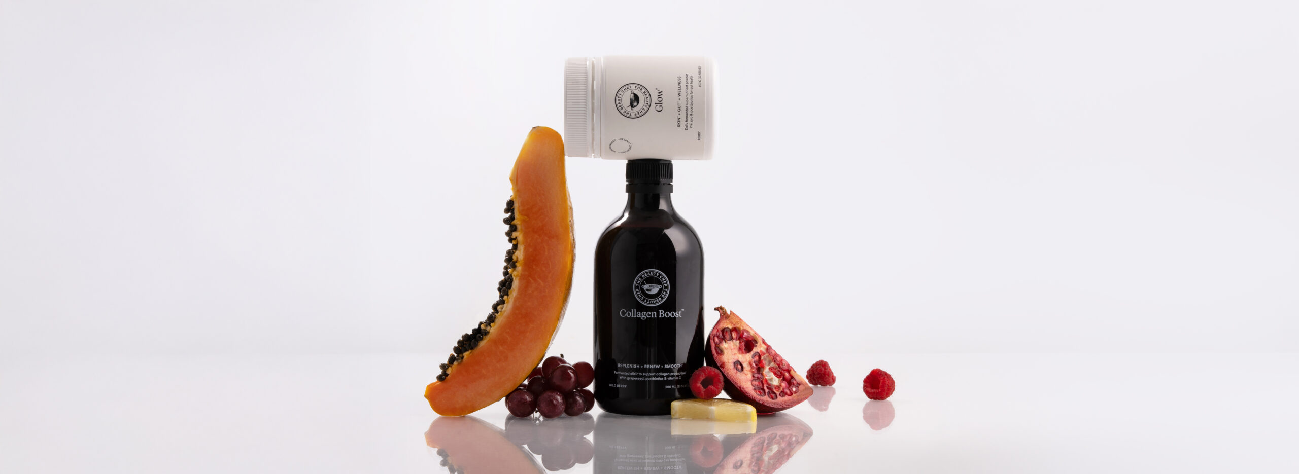
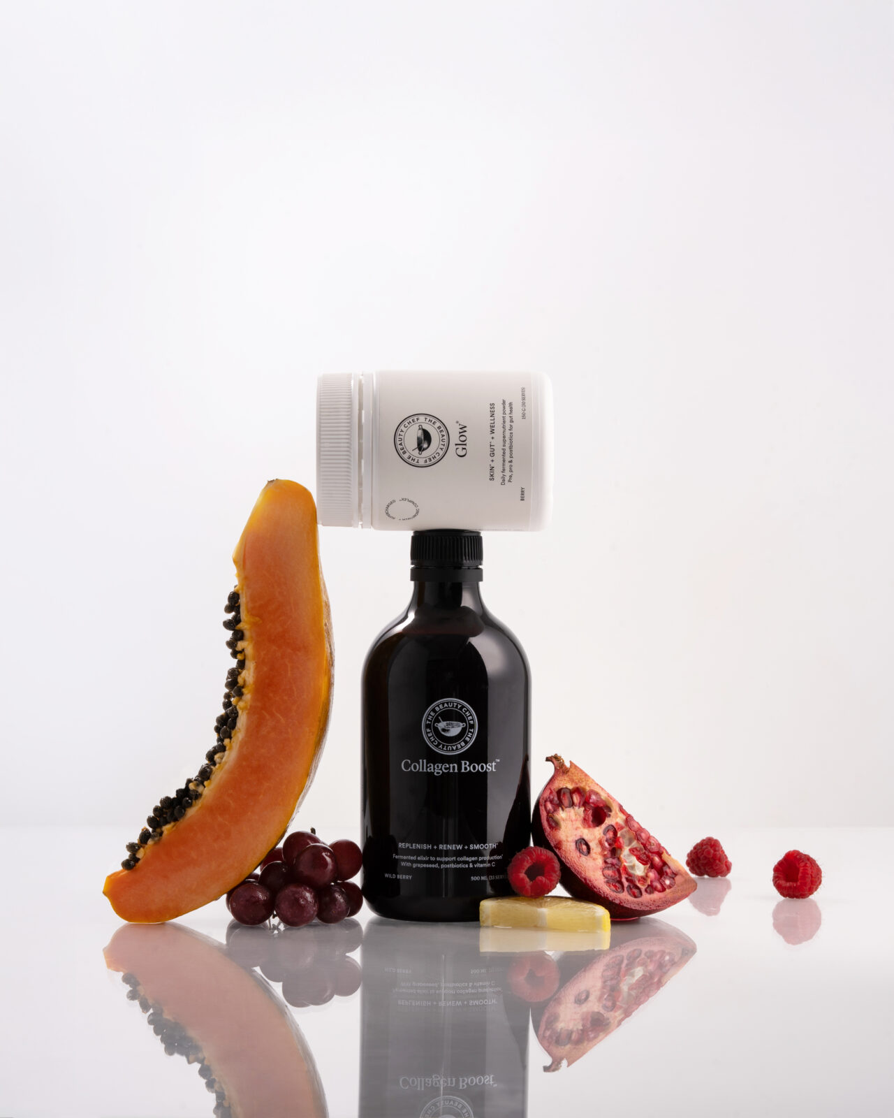
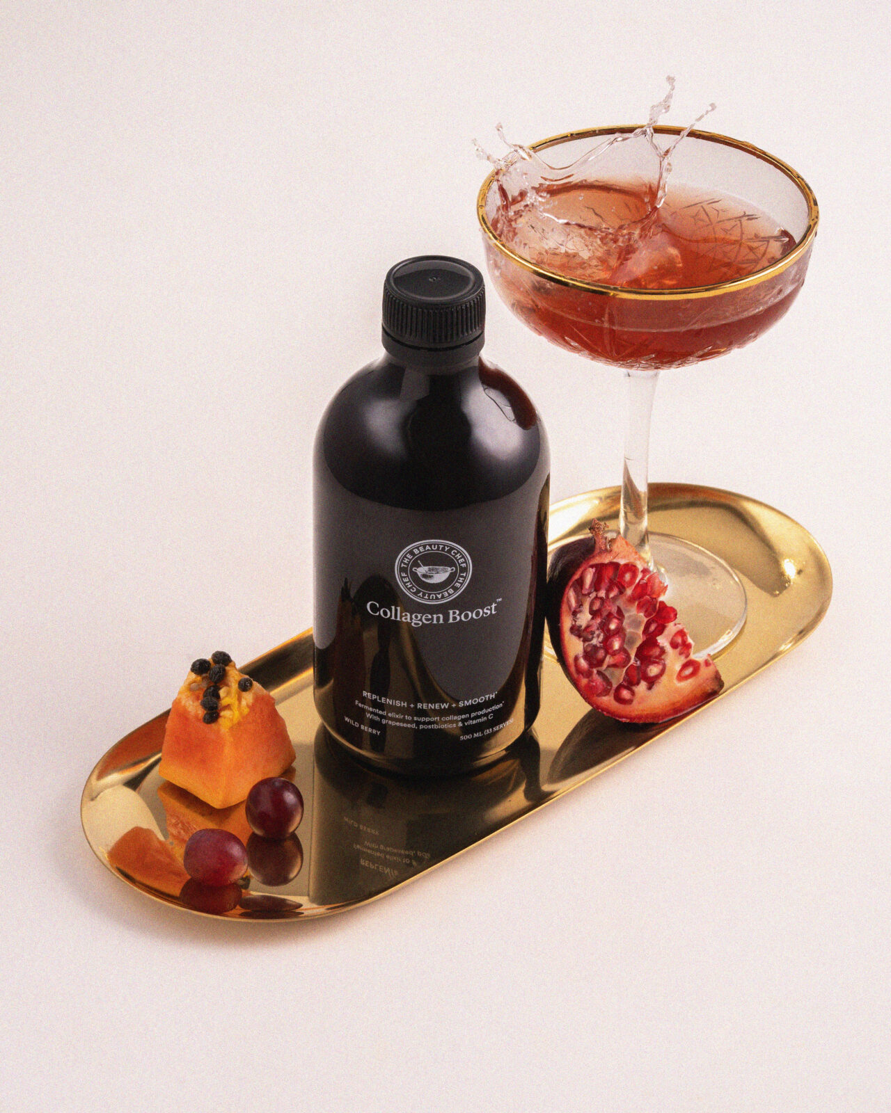
I very much was drawn to the challenge of styling fruit in a way that felt elevated and restrained. Moving away from excess and towards a more minimal, high end approach. Allowing the products to remain central while still telling a story.
Visual Direction & Mood
Focusing in a sense of calm was the focal point for this project. I wanted the imagery to feel grounding, quiet and considered – something that invites pause rather than demands attention.
The overall mood sitting at the intersection of luxe and minimal, with a subtle sense of glow throughout. In comparison to my more commercial or client-led work I’ve produced in the past, this direction leans into a softer and refined approach. Where my work often features stronger lighting and harsher shadows, this project intentionally embraced restraint.
Colour Palette, Texture & Detail
The colour palette was informed by The Beauty Chef’s existing visual language across their website and social platforms. Hence allowing the images to be in alignment with their current visuals.
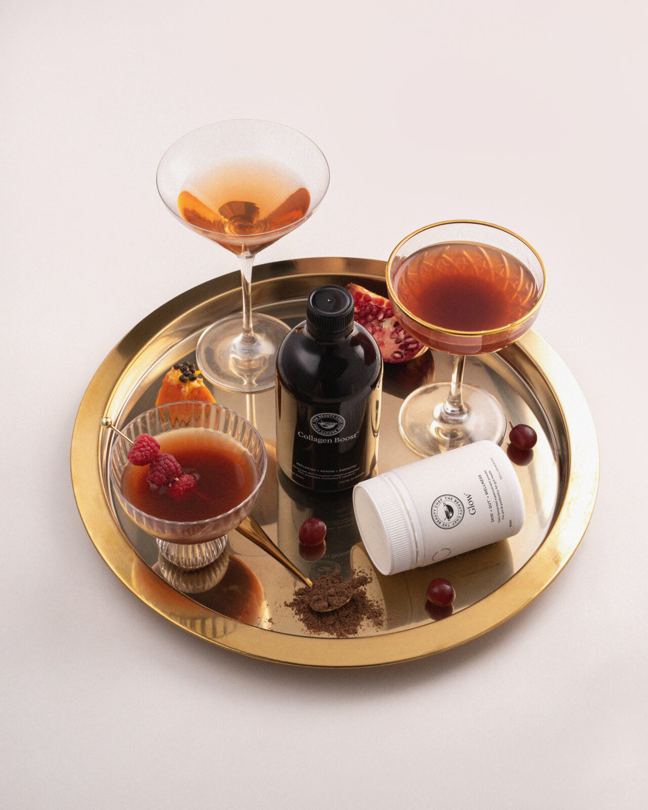
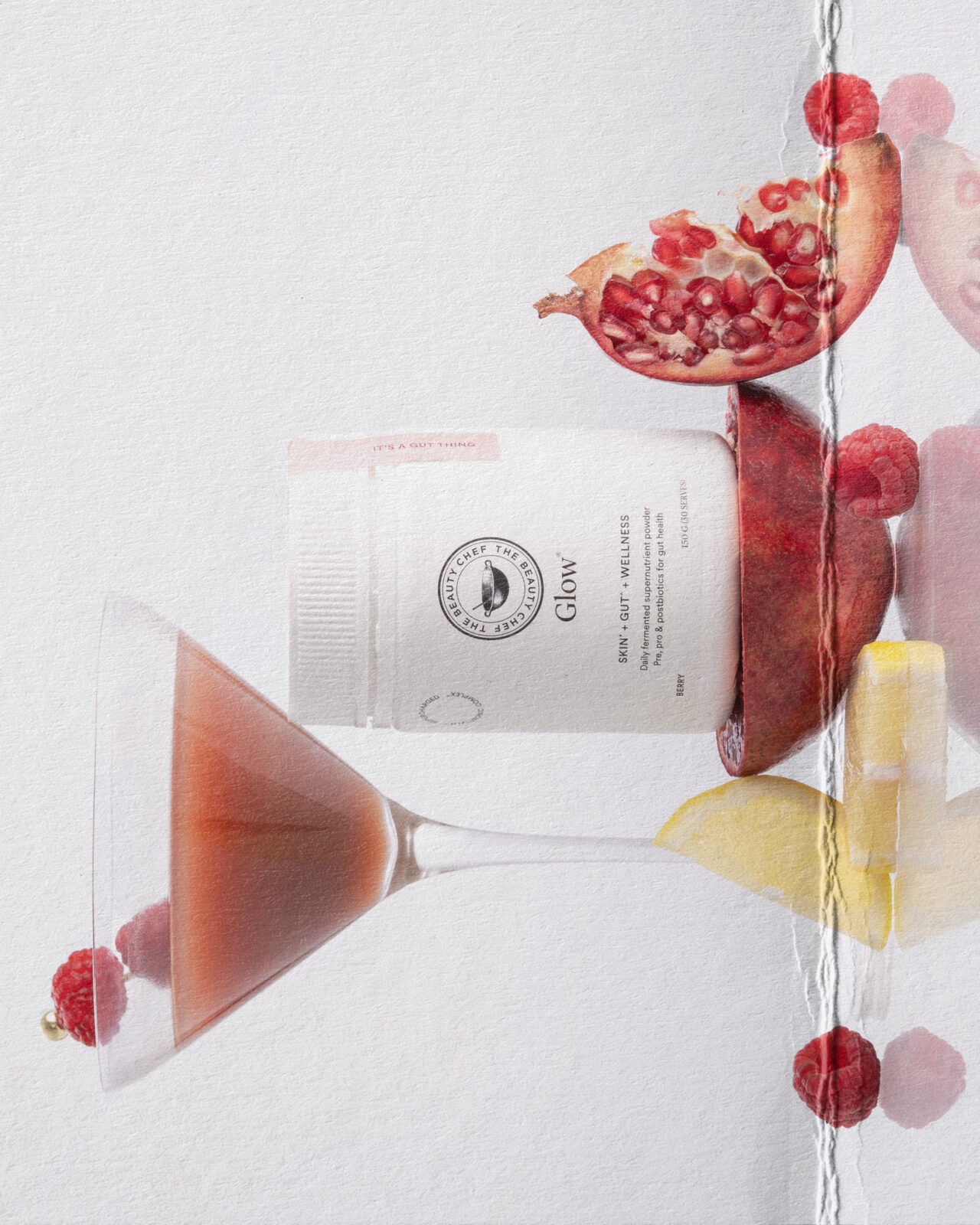
Texture came from the fruit, referencing the key ingredients however were treated minimally and styled with intention. Gold accents were introduced via trays and spoons as a subtle nod to glow – echoing how the products are positioned without overpowering them.
Styling & Set Design Choices
Approaching the styling with restraint was at the forefront of this project. Gold hardware, high end glassware and negative space working together to create a sense of ritual. Almost as if the viewer paused mid-day to enjoy a moment of calm and care.
Due to this anything that felt visually heavy or overly complex was intentionally left out. The goal being clarity, therefore allowing the product to lead while being supported by elements that enhanced rather than competed.
Negative space and simplicity are becoming increasingly important in my work. This project rearmed how powerful it can be to let an image breathe.
Lighting Philosophy

Lighting played a defining role in shaping the final outcome. Gravitating toward a very soft, diffused light to eliminate harsh shadowing and creating a more atmospheric feel.
This approach helping me in communicating a sense of calm and elevated the overall perception of the imagery. Soft lighting, when used intentionally, has a way of making still life feel more considered and high end – something I was very conscious of throughout the shoot.
The focus was on using two sheets of diffusion paper on both the left and right hand side of the scene. Accompanying the diffusion paper were two Godox AD600 Pro II with soft boxes to further soften and diffuse the light.
Still Life as Wellness Storytelling
Still life photography lends itself beautifully to wellness brands. It allows the products purpose and story to be communicated through art direction rather than instruction.
Where lifestyle imagery can sometimes distract, still life offers clarity. It places the product front and centre, while still creating an emotional response. For me, these images are about evoking a sense of ritual – something that feels nourishing, calming and intentional.
Creative Learnings
This project reinforced that I’m moving in the right creative direction. Reminding me to trust my instincts and lean further into my own style.
An unexpected learning came in post-production – how subtle changes, like adding or removing grain, can dramatically shift how an image feels. Small decisions making a significant differences to the final tone.
Most importantly, reminding me how enjoyable it is to simply experiment without pressure.
Closing Reflection
This project feels like a clear reflection of where I’m heading creatively. Capturing my appreciation for minimal, high end, art direction led imagery and my desire to create work that feels considered and calm.
For brands viewing this work, I hope it quietly communicates care, skill and intention – and invites you to imagine your products within a similar scene.
View more of my work here