

GLOW UP BEVERAGES
Glow Up Beverages is a Gold Coast based cocktail business launching an innovative range of cocktails. Taking Australian natives and combining them within classic cocktail mixes. However, the innovation continues with the incorporation of collagen in the vodka cocktail mixes. The three flavours include French Martini, Lychee Martini and Cosmopolitan. Additionally the collagen powder within the cocktails is from their sister company Ever Hair, which I also took photos for.
CREATIVE BRIEF
The client’s vision for the visuals were minimalistic and on trend. Key focuses within the images were highlighting ingredients, movement and texture. Another aspect to take into consideration was the combination of using the can and glassware for the photos. Additionally incorporating bright and glowy light to allow the product, prop and glassware to pop.
Furthermore mood boards focusing on the key visuals were supplied. The mood boards covered more minimally styled images, lifestyle, texture including sand and water and images highlighting ingredients.
For the backgrounds the focus was on the beige branding colour palette. Adding pinks and whites to the colour palette came after the completion of test shots.
Individual shots per flavour along with group images were a requirement. Due to this the shoot planning process was focusing on making sure each flavour had similar images.
STYLING
Contrarily the planning for the images required each flavour to have similar styles of images as seen within the brief. Ranging from holding the can, ingredient shots, lifestyle too minimal with shadowing. Following the individual image came the planning of the group images focusing on the incorporation of the cans with the glassware featuring the cocktail. Along with an image on white with shadowing to cohesively tie in with the individual images.
The main focus for the prop selection was the glassware for the cocktails. Glasses from Cristina Re, Fazeek and Cotton On were chosen. This is due to to the modern and minimal design of the glasses. Deciding to add cocktail garnishes to the beverages allowed for a pop of colour.
Deciding to add broken travertine is for textural purposes along with allowing to create height. This is beneficial specifically for group images where multiple products and props are needing to be within the scene.
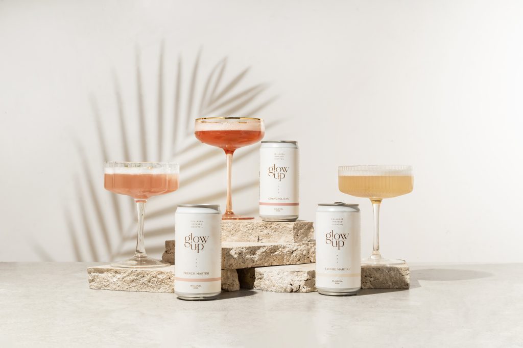


As shown above it sees the styling process for the group image. For this image my main focus was highlighting the range of cans along with the cocktail in the glassware. I chose to style and photograph it in landscape, this is in order for it to be a banner on the website. To begin with I placed the stone down as the foreground, opting to use a vinyl background worked perfectly.
Placing the desk I am working on away from the wall allows for me to illuminate light onto the background, along with giving me space to play with shadowing. As the focus was the range of cans, with this in mind the layering of travertine is required to create height in order to see the range. Furthermore, the addition of the palm leaf shadowing on the background is for depth. Additionally, it allows for a subtle nod to the summery vibe.
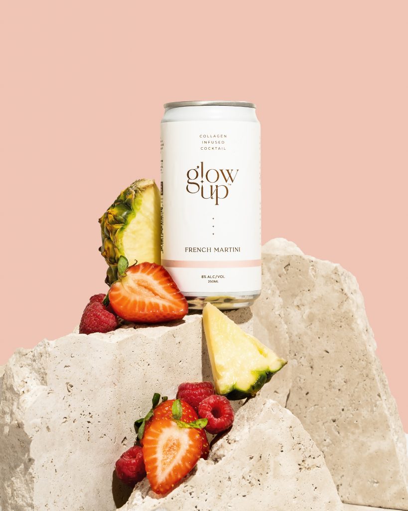


An aspect of photography is keeping in mind the use of the photos. In this case it was social media and website use. Specifically requesting a style of image used across all three flavours for the shop section of the website. As a result of this I knew I didn’t want to opt for the plain background with the product simply standing on it.
Due to this thinking outside of the box is the key in the development of suck an image. coming back to the use of travertine to create height was key for this image. Deciding to turn the broken travertine on its side instead of the usual way of placing it allows for it to turn into a shelf. The concept in my mind was to be able to place the can on a section of the travertine and place the ingredients that goes with that flavour to cascade from behind that can onto the travertine placed underneath.
Needless to say this concept was challenging, requiring plenty of patience and experimenting. I had to play around with the placement of the individual broken pieces in order to determine which ones were best for each spot. In order to get the pieces to stay or to have the correct height, I used other objects to build the height or hold the piece in place. This allowed me to get the desired outcome for how I wanted the pieces to stay.
Once the broken travertine was in place, I placed the can in the position it best sat. Opting to use blu-tac in order to secure it and as a reference or placement for the other two cans. After I was satisfied with the placement of the can, it was time to place the ingredients around and down the travertine. Just like the placing of the travertine this step required patience. This is due to balancing the ingredients on one another or the travertine.
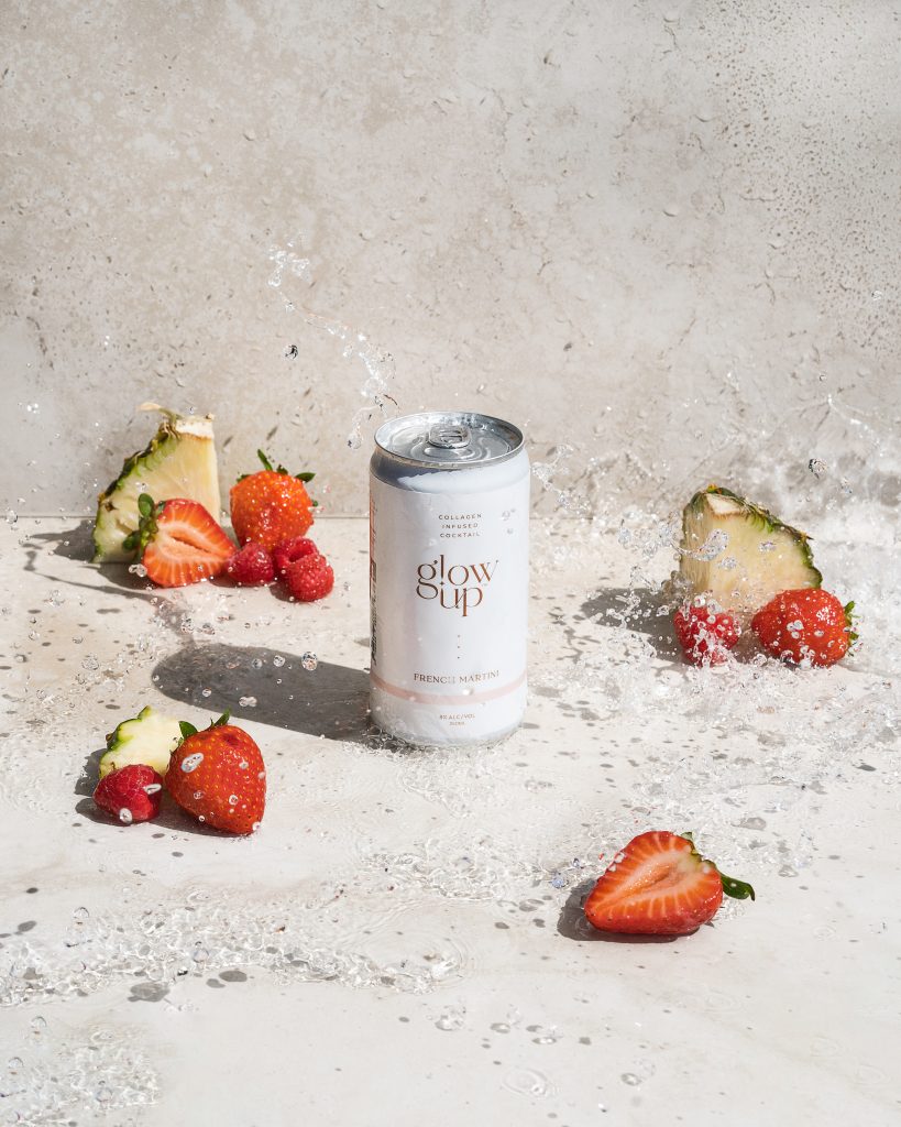

If you have been following me for some time, you will know I love water photography. For this image the focus was on showcasing the can along with the ingredients. The addition of a water splash was to add further texture and interest. To begin I placed stone tiles for the background. You will see that I am photographing outside, I personally prefer photographing water images outside. Once the tiles were placed, I begun by placing the can in the centre. This is in order for the focus to be on the can and for the ingredients/props to be easily placed around the scene.
Opting to place the raspberries and pineapples in the foreground, middle ground and background highlighting the tasing notes of the beverage along with the framing the product. In terms of the water element, I photographed this image twice. This was due to the addition off strawberries. The first image my boyfriend, Warwick assisted me in throwing the water over the scene. I was in charge of both the taking of the photo and the splashing of water. In order to accomplish this, I opted to use the self timer setting where it takes three consecutive images after counting down from the chosen time.
EDITING
I will be showcasing the editing process for one of the above images. For the editing process I always being by selecting the images through Lightroom and importing them in order to perform basic edits. When I say basic edits I am referring to such things as brightness, contrast, highlights, shadows, whites, blacks and clarity. Depending I may tweak the colour balance, hue/saturation and brightness of colours and dehaze the image.


Photoshop Editing – Group Image
Beginning the editing process I select the rectangular marquee tool to select the area in which I want to expand the tiles used. In order to this I go to the content aware fill option in which it automatically selects the pixels to duplicate within the area selected. With the spot healing brush, I move around the image removing any unwanted marks, dust etc. I also proceed to use the spot healing brush to remove the palm leaf as I didn’t want the greenery within the image, only the shadowing it was casting.
To create a consistent coloured background, I create a new layer and select the brush tool. I lowered the opacity allowing me to later until happy with how it looked. To remove the added colour on this layer, the object selection tool was used and the eraser tool to remove any unwanted colour from the products and props. To perfect the erasing of the colour, the lasso tool was used in conjunction with the eraser tool. I also use the eraser tool to remove the added colour on the palm shadowing.
Moving on to the perfecting of the products, I begin by using the healing brush tool to remove any unwanted marks or scratches from the labelling. Once happy I use the dodge and burn tool, specifically the dodge tool to brighten any areas that are appearing too dark. I respect the spot healing brush and work on removing any imprecations within the cocktails. This is due to the method used to create the foam. I proceed to use the colour range option to select the colour of the particular cocktail I am working on. This allows me to specifically edit that selected area and change the hue and saturation levels to match the true colour of the liquid.
Below is a before and after. If you have any questions, let me know in the comments or message me on Instagram.
